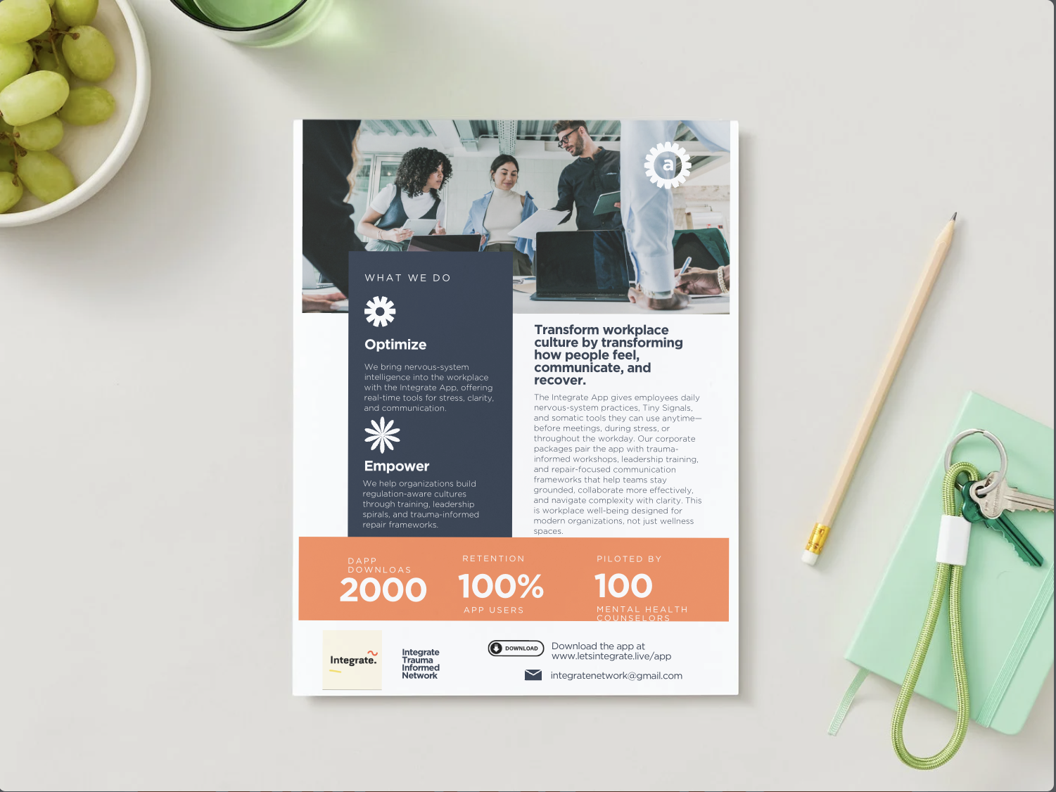
Somatic UX for Digital Health
Integrate App • Product Philosophy • Design Framework
Overview
Somatic UX is the design approach I created for the Integrate App to ensure digital health tools meet users where their nervous system actually is.
Instead of relying on motivation or cognitive load, Somatic UX builds experiences that are state-responsive, gently paced, and biologically realistic.
This framework integrates Polyvagal Theory, behavior design, interoception, and trauma-informed practice to support sustainable engagement and capacity-building.
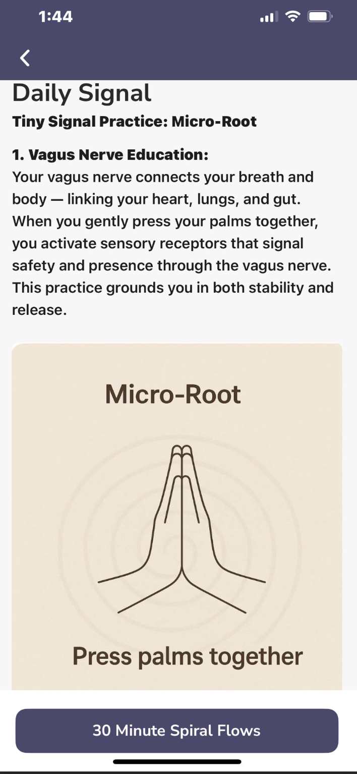
How This Screen Reflects My Somatic UX Audit Style
Nervous-System–First Design:
Clear hierarchy, soft visuals, and simple language reduce activation and help users settle before taking action.
Micro-Yes Behavior Flow:
One tiny, doable step (“Press palms together”) eliminates decision fatigue and aligns with real nervous-system capacity.
Meaningful Somatic Context:
Brief vagus nerve education builds safety, clarity, and user trust — a core element in all my Somatic UX recommendations.
My Role
• Product Lead – Somatic UX
• Systems Designer – Tiny Signals Method
• Creative Director – Visual Co-Regulation + Art Integration
• Behavior Design Architect – State-responsive flows
• Founder – Integrate Trauma-Informed Network

The Problem
Most digital health tools overestimate user capacity.
They assume people can focus, self-motivate, or make complex choices regardless of nervous-system state.
This results in:
• Drop-off during stress
• Overwhelm
• Low adherence
• Short-term engagement
I designed Somatic UX to bridge the gap between intention and biological capacity.
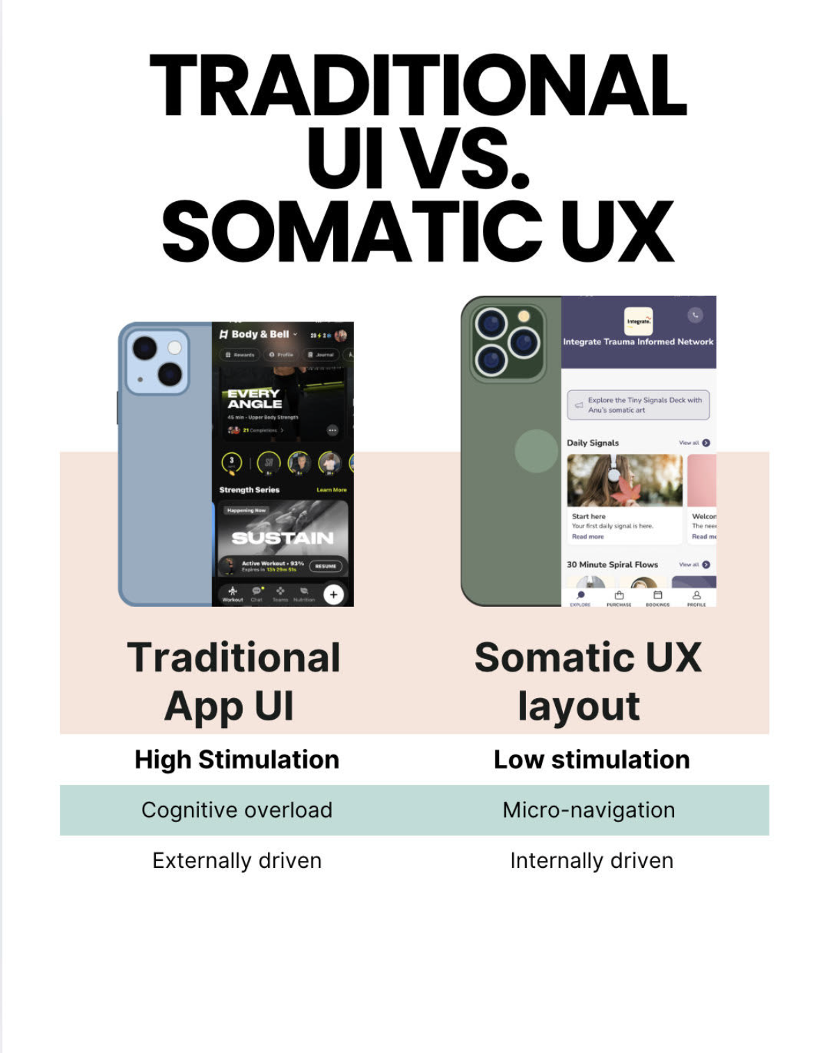
🌿 Traditional UI vs. Somatic UX (Side-by-Side)
Traditional UI (Example: Fitness App)
High Stimulation + Competitive Energy
Bright colors, badges, timers, progress bars, and social stats create constant performance cues.
Cognitive Overload
Multiple calls to action (“Resume,” “Learn More,” series cards, tabs, and metrics) demand quick decisions and focus.
Externally Driven Motivation
The interface relies on pressure—streaks, achievements, completions—to push engagement.
Somatic UX (Example: Integrate App)
Low-Stimulation, Nervous-System-Safe Design
Soft colors, spacious layout, and simple imagery reduce activation and signal safety.
Micro-Yes Navigation
Only one clear next step at a time (“Start here,” “Daily Signal”), easing decision fatigue.
State-Responsive + Internal Motivation
Practices meet the user where they are, with gentle language and supportive flows that encourage regulation over performance.
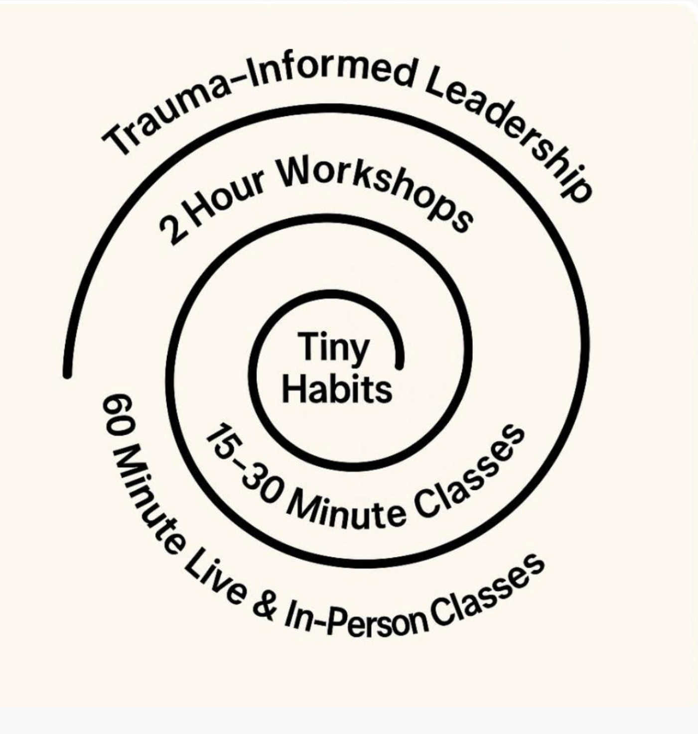
The Somatic UX Solution (Framework)
A 4-step micro-cycle embedded throughout the Integrate App:
1️⃣ Sense – Identify current state
2️⃣ Settle – Widen capacity by 1%
3️⃣ Shape – Choose what feels possible now
4️⃣ Integrate – Track micro-shifts over time
This cycle lowers cognitive load and increases the likelihood of meaningful engagement.
“This app meets me where my system is. I like that I do not feel pressured.”
How I Applied Somatic UX in the Integrate App
✨ Tiny Signals (Micro-Practices)
Short, sub-60-second practices that support nervous-system regulation.
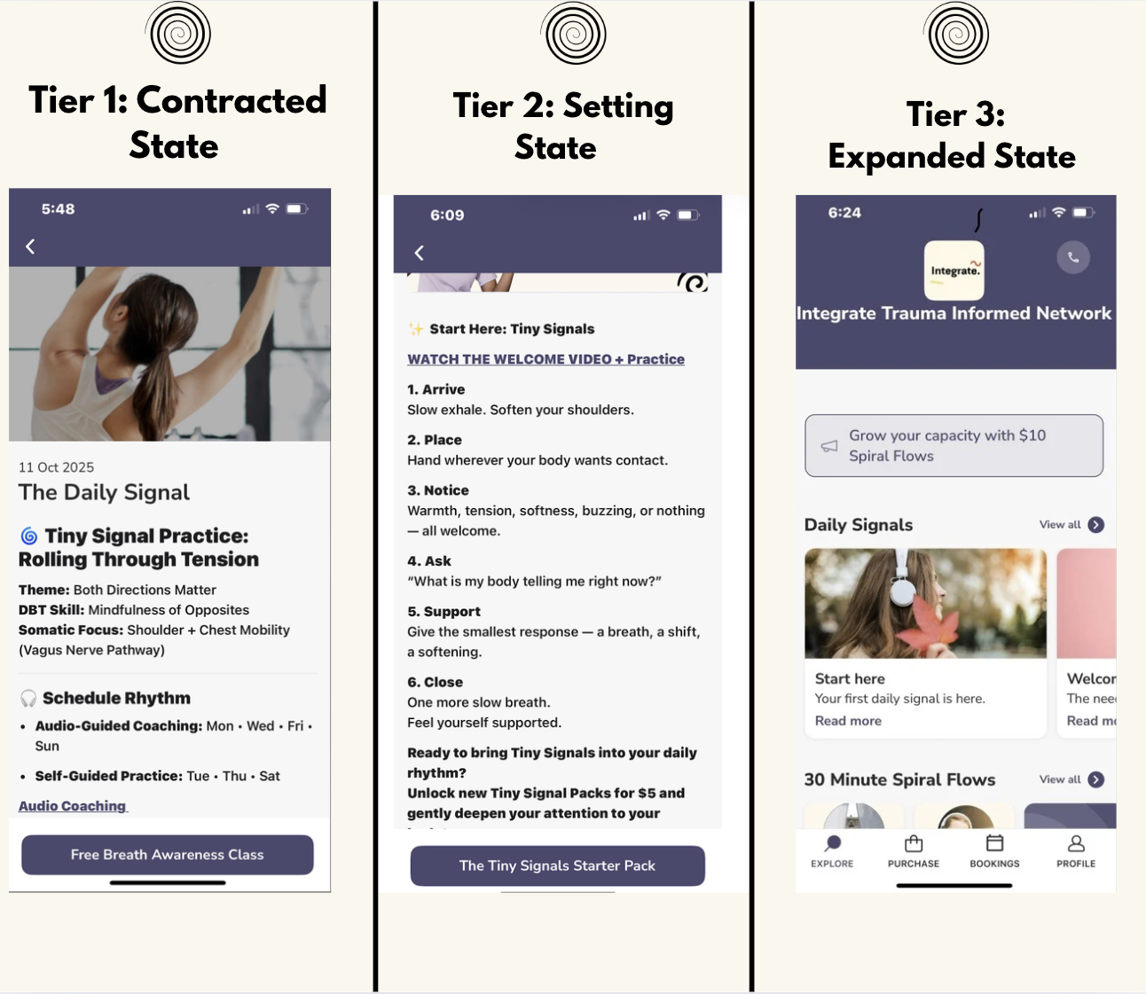
Breaking it down tier by tier: State-Responsive Flow in the Integrate App
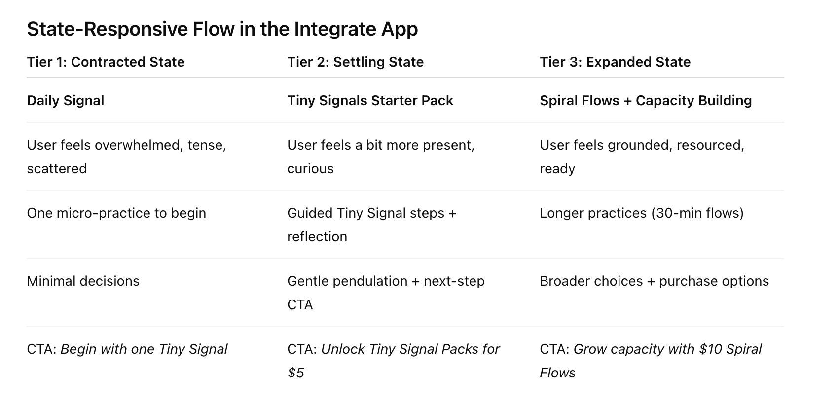
The Three Tiers Reflected in the App (State-Responsive Content Flow)
1️⃣ Tier One — Contracted State: “Start Here / Daily Signal” (Screen 1)
What the user feels: scattered, tense, overwhelmed, unsure where to begin.
What the screen offers:
A single Daily Signal
A clear micro-practice (Tiny Signal Practice: Rolling Through Tension)
Minimal decision load
A simple CTA (Free Breath Awareness Class)
Why this is the contracted state tier:
This screen delivers one gentle entry point — exactly what a dysregulated or compressed system can hold.
The UI says: “Begin with one signal.”
2️⃣ Tier Two — Settling + Orientation: “Tiny Signals Starter Pack” (Screen 2)
What the user feels: A little more present, curious, open.
What the screen offers:
A guided step-by-step Tiny Signal practice
Reflection prompts (“What is my body telling me right now?”)
Micro-wins + embodied awareness
A next-step CTA: “Bring Tiny Signals into your daily rhythm… Unlock more Tiny Signal Packs for $5.”
Why this is the settling state tier:
This screen supports pendulation — the move from micro-regulation to gentle expansion.
The user has more capacity, so you introduce a paid, low-lift next step that aligns with that new capacity.
3️⃣ Tier Three — Expanded State: “Grow Your Capacity / Spiral Flows” (Screen 3)
What the user feels: grounded, resourced, ready to learn, ready to invest.
What the screen offers:
Higher-level practices (30 Minute Spiral Flows)
More cognitive spaciousness
App-wide navigation + choice
Purchase options (“Grow your capacity with $10 Spiral Flows”)
A library of Daily Signals to browse freely
Why this is the expanded state tier:
This is where the user is ready for depth, learning, immersion, and purchasing.
The UI reflects their increased capacity: more openness, more options, longer practices, and higher-ticket offerings.
The Integrate App adapts to the user’s state:
Tiny Signals for contraction → Starter Pack for settling → Spiral Flows for expansion.
This is the core of Somatic UX methodology.
Impact
The Somatic UX approach has led to:
✔ Increased user retention
✔ Higher completion of micro-practices
✔ Lower overwhelm at entry points
✔ Stronger sense of safety + attunement within the app
✔ A unique nervous-system-literate user base
Somatic UX Consulting
Alongside building Integrate, I now share this framework with digital health teams looking to create more humane, nervous-system-aware products.
Services include:
• Somatic UX audits
• Behavior design strategy
• Trauma-informed content systems
• Nervous-system-literate UI guidance
• Team training in state-responsive design